My final piece consists of a leather bound book in which is an illustrated version of J K Rowlings 'The Fountain of Fair Fortune' from her small series of fairy tales 'The Tales of Beedle the Bard'. As well as two digitally coloured prints of two of the illustrations inside the book.
I took inspiration from Rowlings book itself as there are a few sparse illustrations that were hand drawn by the author herself. These drawings are fairly simple and adorned with flower motifs. I wanted to go into ore detail with my illustrations and be even more creative with unique designs.
If I were to do this again I'd manage my time more effectively, spending less time on development to give myself more time with the creation of the final piece. Which is a point that was brought up by one of my peers, he said that I put my all into making good development, leaving myself with no time or artistic energy for the final piece. I feel that had I been more efficient with my time then I would have been able to make my book better.
Originally I was planning to write everything in the book with pen, but I did not give myself enough time, which is why the writing is in pencil while the illustrations are in pen. This bring up another problem that I had, the pen is fairly visible through the backside of the paper, making the writing hard to read. The pen also smudged easily as the paper is not that absorbent. In hind sight I would have forgotten about the pen and created it all in pencil.The fact that both the front and back covers of the book are not flat was the leading cause of my illustrations being messy and sketchy because I could not make clean and clear lines.
My first tries at my digital pieces were complete failures, so I pulled an all-nighter, drawing two much better illustrations that showcase my digital skills in a good light. I am proud of my digital drawings but am disappointed with how my book turned out, however I did like my typography with the title and the 'The End' page, I think it looks clean and professional.
Tuesday, 24 May 2016
FMP Final Pieces
 |
| I really like this drawing of Altheda, however she does look a little flat, if I were to draw this again or add to it I'd try to make her look more three dimensional with some additional shading perhaps. I wanted her to look like a dirty blonde, I gave her a red nose to maybe portray that she is in the cold a lot as her character is poor, accented with a cold blue and simple background. |

 |
| I much prefer this drawing to my original digital sketch of the worm, I made the lines a lot neater and I gave him much smoother shading with a dash of texture that I like. I'm not too keen on the background but I thought it looked better than having just a flat colour, this way it looks more like a forest background at first glance. I tried to keep the colours muted as it is a sad scene with a gross monstrous worm to help portray the mood. If I gave myself more time to work on it I'd have drawn a real background, with trees and flowers, perhaps even the other characters. |

Thursday, 19 May 2016
Digitally Coloured Illustration Sketches
These two images were very quick digital sketches to feel out an idea of what I'd like to do as my digital final outcomes, I stuck with the worm idea but didn't use the fountain. If I spent more time on the worm I'd have made the shading a lot smoother, like it is in the fountain drawing, I think that would make it look a lot better. I'd also redraw the lines completely as the ones I used were very rough and wobbly.


Thursday, 21 April 2016
Digital Development
 |
| This old wizard was drawn as both digital development and to add to the catalogue. I really liked his design and it saddened me that I couldn't use him in my final outcomes as he did not relate to the chosen story. |

Monday, 11 April 2016
The British Museum and National Gallery
Me and a few of my friends made our way to The British Museum in London and after getting lost for an hour we finally arrived. I took some pictures of interesting items I thought had good detail, interesting textures or forms to help me and inspire me to design my worlds and items/clothing in those worlds.


 |
| The designs on these drinking horns were beautiful and I love these types of horns in general. |


 |
| I could image things like this being worn by a more upper class creature or race, the repeating pattern of gold pleases the eye. |
 |
| I especially love the design of this hand-mortar. It looks badass, like it could blow a big chunk out of anything. |
 |
| The intricate design on the handle of this crossbow is beautiful. |

 |
| The head of this spear is amazing, these kinds of details is what I would love to add to my own designs. |


 |
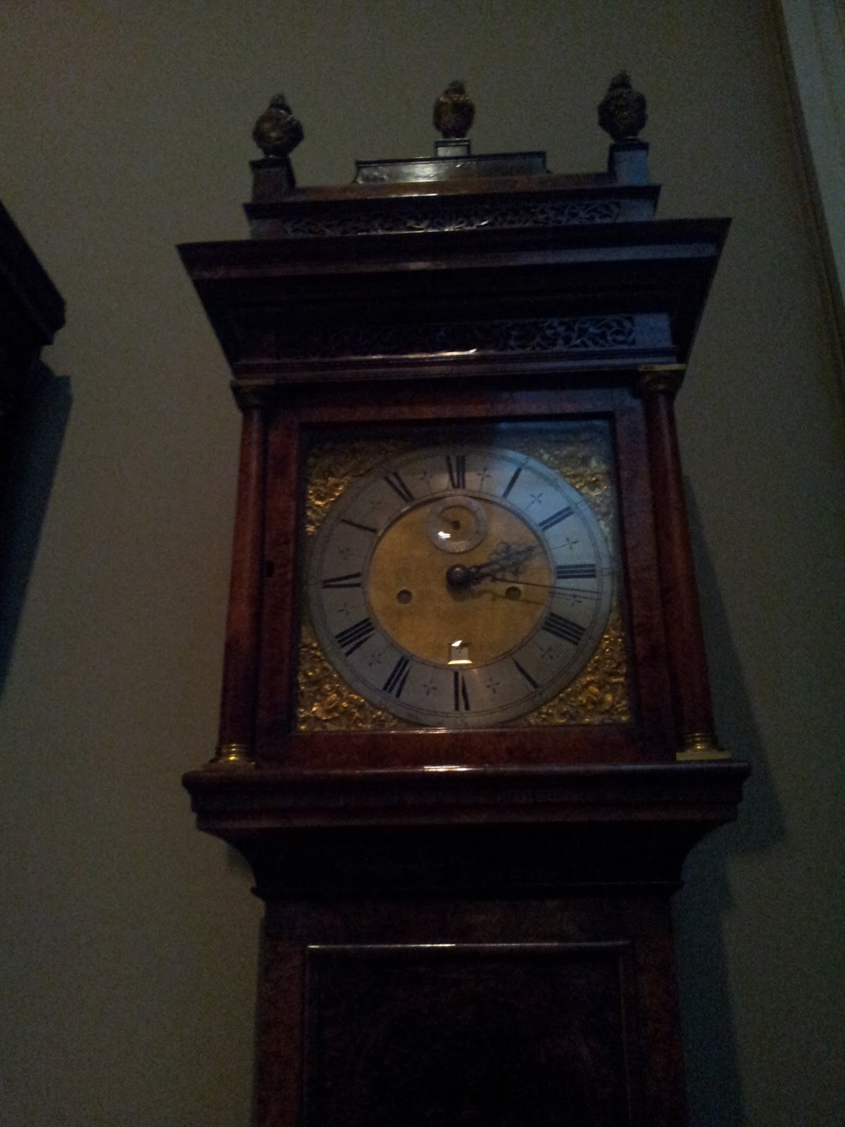
| The excessive detail on this CLOCK is staggering. It is completely unnecessary for a simple clock to be this complicated but none the less it is beautiful. |


 The gladiator helmet works well for intimidation and also looks great aesthetically, it makes me imagine what deadly man wore this to battle.
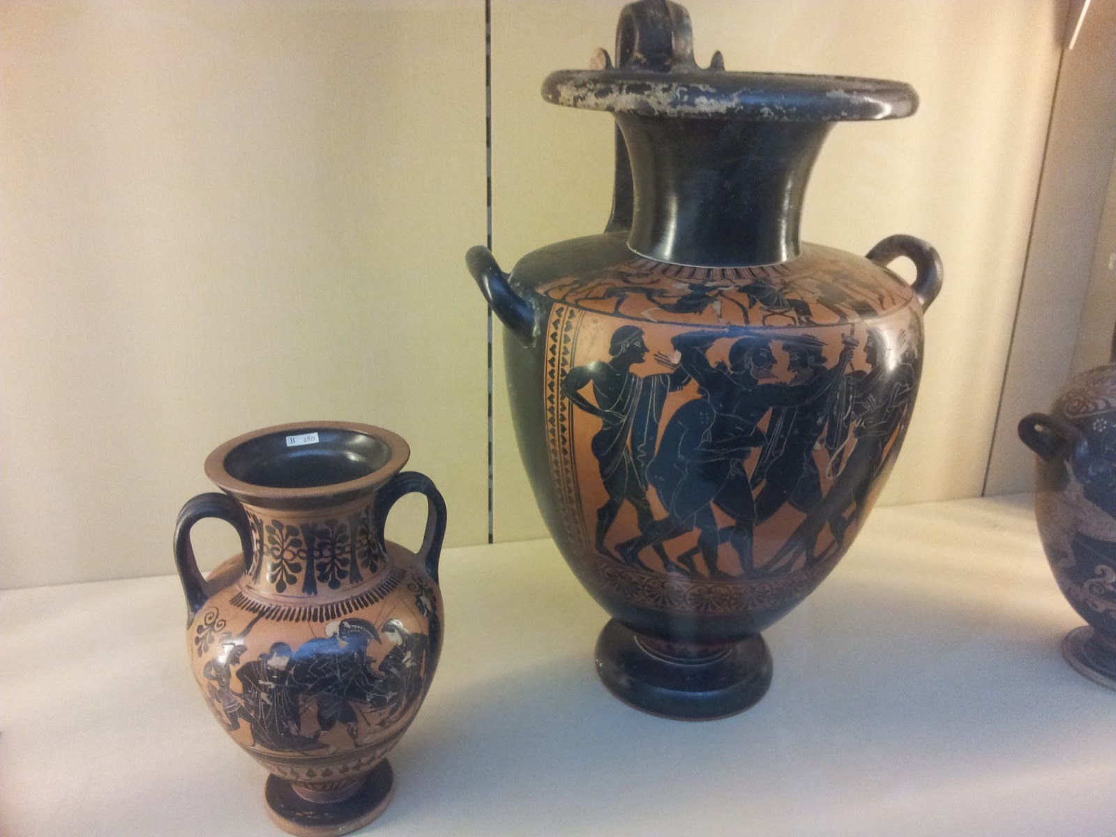
 |
| The design of this griffin is very interesting, I love the illustrated tales on these pots. |


Fleshing out the Narrative - Themes and artists
Fleshing out the Narrative
In
this project I will aim towards creating a fantasy, sci-fi
or
horror world through
a narrative that I will illustrate and design. From characters and creatures to
fashion and plot specific items, I’ll create a large body of illustrations to
help the viewer/reader visualise the world I’m designing.
I
will either be writing the narrative myself or finding an interesting
pre-existing story to illustrate. For my outcomes I’d aim to professionally
draw main characters and show key plot moments of the narrative. As a final
piece I’d like to fully illustrate and create a book, to help make my work more
tangible.
My
Themes
My themes are all types of narratives that could also be applied to artwork that I like to create. The themes would be the driving point behind what story I would choose or write. I could choose just one of these themes or I could find a way to include them all.
Fantasy of Manners – A Fantasy of Manners story would be centred around a neighbourhood or a small community. Focusing on social status and secrets instead of battling a monstrous foe and usually in an Urban setting, somewhere with people close to each other.
Beauty and the Grotesque – I find the contrast between the grotesque and the beautiful to be very pleasing to the eye. It gives a unique perspective on both sides of the coin. The grotesque would look even uglier when compared to something on the other end of the spectrum and vice-versa. This juxtaposition is something I explored in my Curate project too.
Romantic Grotesque – This theme would focus around a single character that is outwardly disgusting and hated however the viewer would not be able to help feeling sorry for the character. Invoking feelings of empathy and pity towards them. While you feel bad for them, you’d still not want to be near them. This theme was key for my British Landscape project as I wanted the viewer to pity my creations.
Mervyn Peake 1911-1968
Mervyn Peake was an English illustrator and author. He is most known for his book trilogy “Gormenghast”, which has been called the first true Fantasy of Manners books. He is also known for illustrating some versions of Alice’s Adventures in Wonderland, Dr Jekyl and Mr Hyde, Treasure Island and Household Tales by Brothers Grimm.
The below illustrations are ink drawings from his Gormenghast series, showing a few of the characters from the story. This series has been very influential to authors, artists and other creators all over the world. Numerous depictions of this story have been produced, even a mini-series from the BBC starring Jonathan Rhys Meyers and Christopher Lee, first aired in the year 2000.
His artworks have an interesting style, favouring the use of hatching and ink washes to shade his illustrations.


Omar Rayyan
Omar Rayyan is an American artist who has worked on some Magic: The Gathering cards and also The Lion, the Witch and the Wardrobe. His style takes inspiration from Renaissance oil paintings to create these beautiful works. He likes to paint fairytale, fantasy and surreal subjects. There’s a series of paintings he created of young women/girls with their monstrous pets, showing that he also likes to explore beauty vs grotesque.
He works mainly with Oil paints on wood panels but he occasionally uses watercolour too. He has a whimsical style that reminds me of children’s books and fairytales from my childhood. I love the designs of his monsters and animals, the way he illustrates and portrays these tales is beautifully done. He also sells his works online, some going for up to $6000 and others for $400.
He works mainly with Oil paints on wood panels but he occasionally uses watercolour too. He has a whimsical style that reminds me of children’s books and fairytales from my childhood. I love the designs of his monsters and animals, the way he illustrates and portrays these tales is beautifully done. He also sells his works online, some going for up to $6000 and others for $400.


Ralph McQuarrie
Ralph McQuarrie is an American concept artist, most known for his work on the original Star Wars trilogy. He designed many characters, including Darth Vadar, Chewbacca, c-3PO and R2-D2.
George Lucas and many fans of Star Wars have said that without Ralph, Star Wars would not have been as good as it was, his vision of the universe made Lucas fall in love, even telling his set designers to “make it look like this”. Ralph has a unique eye for dynamisism, George even composed a lot of the shots in the films to mimic Ralphs paintings exactly. He works mostly with Oil paints and on a large scale.


Here is a page from the artist Chelsea Douglas who worked as a concept artist for the game Bioshock: Infinite. This page is similar to the kind of outcomes I would like to produce, huge bodies of illustrations with variations on designs.

Subscribe to:
Comments (Atom)